In recent years, dark themes have become increasingly popular in web applications. They provide a sleek and modern look, reduce eye strain, and can even save battery life on devices with OLED displays.
If you’re building a React JS app, implementing a dark theme feature can greatly enhance the user experience. In this article, I will show you what I personally think is the best way to implement a togglable dark theme.
Go to:
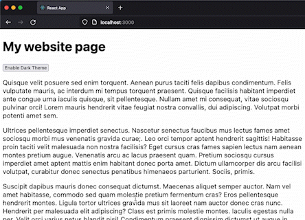
Output
The idea is to ensure the visitor stays on the desired theme whenever they reload or visit the page again.
This tutorial also includes checking the browser’s theme to use it on the app the first time you visit the page.
You can download the project from this public repository:
How to add the dark theme feature to your React JS app
Step 1: Create a React JS app and import the required hook
If you haven’t already, create a new React JS project using your preferred method (e.g., create-react-app). This will provide you with a basic project structure to work with.
You may also refer to the React JS guide here.
We will be using the hook called useState and useEffect from the React package. These functions are used to manage state and perform side effects in React components.
useState will be used to store the current theme state while the useEffect is for loading the correct theme when the component or page is loaded.
Here’s how you import these hooks:
import { useState, useEffect } from "react";
Let’s initialize the state variable theme using the useState hook. The theme variable holds the current state of the theme, and setTheme is a function used to update the value of theme. The initial value of theme is set to false, indicating the light theme.
const [theme, setTheme] = useState(false);
Step 2: Create a toggle button
Add a simple button HTML tag with a click event listener:
<button onClick={toggleThemeHandler}>{theme ? 'Disable' : 'Enable'} Dark Theme</button>
This button will serve as our toggle button to enable or disable the dark theme, and to make that possible, we need to add an event listener called onClick and pass a function name called toggleThemeHandler (which I will discuss in Step 4) that handles the toggle functionality.
Step 3: Add the CSS
The CSS is pretty straightforward. When the dark mode is enabled, we will add a class called dark-theme to change the background and text color to their opposite colors when the dark theme is enabled.
body.dark-theme{
  background-color: #1d1d1d;
  color: #e2e2e2;
}
Step 4: Add the functionality
Now, the core functions that are responsible for the theme selector functionality. I will break down all the functions and other logic and explain each so you can understand their purpose.
// Toggle theme handler
const toggleThemeHandler = () => {
  setTheme((state) => {
    if(state){
      localStorage.setItem('theme', 'light');
    }else{
      localStorage.setItem('theme', 'dark');
    }
    return !state;
  });
};
The toggleThemeHandler function is responsible for toggling the theme between light and dark. It is called when the user clicks the button we have added earlier. Inside the function, setTheme is a callback function that updates the theme state variable and stores the new theme value (“light” or “dark”) in the browser’s local storage.
// Check if browser theme changes
window.matchMedia('(prefers-color-scheme: dark)').addEventListener('change', event => {
  if(!localStorage.getItem('theme')){
    setTheme(event.matches);
  }
});
The matchMedia API detects changes in the user’s preferred color scheme (light or dark) in the current browser they’re using. When the color scheme changes, the provided callback function is executed. If the theme is not explicitly set in the local storage, the callback function updates the theme state variable based on whether the new color scheme matches the dark mode or not.
// Set the theme upon load
useEffect(() => {
  if(localStorage.getItem('theme')){
    setTheme(localStorage.getItem('theme') === 'dark');
  }else{
    if (window.matchMedia && window.matchMedia('(prefers-color-scheme: dark)').matches) {
      setTheme(true);
    }
  }
}, []);
The useEffect hook is used to initialize the theme upon component load. It runs only once because of the empty dependency array []. It checks if the theme is already set in the local storage. If it is, the theme state variable is updated accordingly. Otherwise, if the browser’s preferred color scheme is dark, the theme state variable is set to true.
// Set class to body tag
if(theme){
  document.body.classList.add('dark-theme');
}else{
  document.body.classList.remove('dark-theme');
}
Based on the current value of the theme state variable, the code adds or removes the CSS class dark-theme to the body tag of the HTML document.
Here’s the overall code (without the CSS code):
import { useState, useEffect } from "react";

function App() {
  const [theme, setTheme] = useState(false);
  // Toggle theme handler
  const toggleThemeHandler = () => {
    setTheme((state) => {
      if(state){
        localStorage.setItem('theme', 'light');
      }else{
        localStorage.setItem('theme', 'dark');
      }
      return !state;
    });
  };

  // Check if browser theme changes
  window.matchMedia('(prefers-color-scheme: dark)').addEventListener('change', event => {
    if(!localStorage.getItem('theme')){
      setTheme(event.matches);
    }
  });

  // Set the theme upon load
  useEffect(() => {
    if(localStorage.getItem('theme')){
      setTheme(localStorage.getItem('theme') === 'dark');
    }else{
      if (window.matchMedia && window.matchMedia('(prefers-color-scheme: dark)').matches) {
        setTheme(true);
      }
    }
  }, []);

  // Set class to body tag
  if(theme){
    document.body.classList.add('dark-theme');
  }else{
    document.body.classList.remove('dark-theme');
  }

  return (
    <div>
      <h1>My website page</h1>
      <button onClick={toggleThemeHandler}>{theme ? 'Disable' : 'Enable'} Dark Theme</button>
    </div>
  );
}

export default App;
Conclusion
In conclusion, implementing a dark theme feature in your React JS app can enhance the user experience and provide a modern look. There are many ways to implement a dark theme feature, including using a pre-built UI library, CSS variables, a theme provider, or a toggle button. By choosing the best approach for your app’s needs, you can easily add this popular feature to your React JS app.